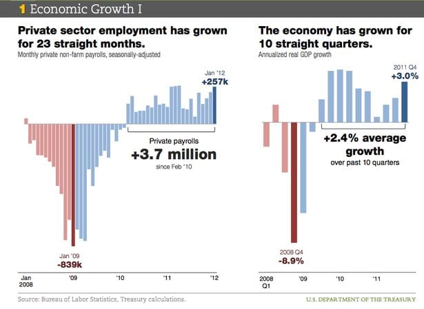
Whether you love the president, hate the president, or think he’s just in over his head, you’ll want to see this. It’s the Treasury Department’s visual slideshow of the state of the economy, called simply The U.S. Economy in Charts
If you’re a fan of the Obama administration, you’ll want to see these graphs because they represent the White House’s case for another term — in easy picture form. The case is: The economy is better than you think. The bailouts and stimulus worked better than you think. And government is smaller than you think. If you hate the Obama administration, you’ll want to see these graphs because it’s going to be an economics-focused election, and you’d better understand the argument your side will be running against.


Facebook Comments